

How to Master the Color Wheel: A Designer's Guide to Perfect Interior Spaces
Ever noticed how yellow rooms make you feel cheerful while blue spaces help you relax? The psychology behind color choices shapes our daily experiences in profound ways. This makes the color wheel one of the most powerful tools for creating spaces that both look and feel exactly right.
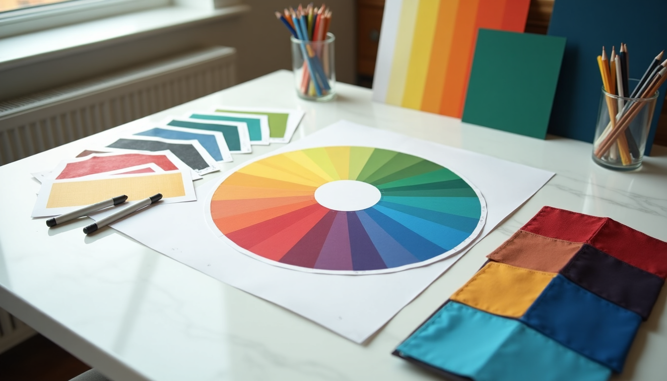
The classic color wheel contains 12 carefully arranged sections - three primary colors, three secondary colors, and six tertiary colors. These building blocks help designers create balanced, appealing color schemes. Professional designers take this foundation further with the 60-30-10 rule: 60% dominant color, 30% secondary color, and 10% accent color. This proven formula turns ordinary rooms into well-designed spaces that catch the eye.
Ready to master color selection for your home? This guide walks you through color wheel basics, shows you how to create perfect color combinations, and helps you pick the right shades for every room. You'll learn practical techniques used by top designers to create spaces that look professionally styled and feel wonderfully livable.
Understanding the Color Wheel Basics
The color wheel might look simple at first glance, but this powerful tool holds the secrets to perfect color combinations. Sir Isaac Newton created the first version in 1666 [20], and today's designers rely on this circular diagram to create spaces that feel both beautiful and balanced.
Primary, Secondary, and Tertiary Colors
Think of the color wheel like a recipe book - it starts with basic ingredients that combine to create increasingly complex flavors. Here's how it works:
Primary colors set the foundation. Red, yellow, and blue (RYB) can't be created by mixing other colors - they're the building blocks for everything else [20].
Secondary colors pop up when you mix two primary colors equally:
Green comes from yellow and blue
Orange appears when yellow meets red
Purple emerges from red and blue
Tertiary colors add richness to the palette. Mix a primary color with its neighboring secondary color, and you'll discover six new hues: vermillion (red-orange), amber (yellow-orange), chartreuse (yellow-green), teal (blue-green), violet (blue-purple), and magenta (red-purple).
Warm vs. Cool Colors: What's the Difference?
The color wheel naturally splits into two distinct personalities.
Warm colors - reds, oranges, and yellows - bring energy and life to spaces. These shades work magic in social areas like living rooms and dining spaces, creating cozy spots perfect for gathering.
Cool colors tell a different story. Blues, greens, and purples whisper calm and tranquility. They shine in bedrooms and bathrooms where relaxation takes center stage.
Here's a designer secret: warm colors make spaces feel closer and more intimate, while cool colors create an illusion of more space. This trick helps you control how a room feels, regardless of its actual size.
Color Properties: Tint, Shade, and Tone
The real fun starts when you play with color properties. These modifications open up endless possibilities for your spaces:
Tints happen when white joins the party. Adding white lightens colors into soft, dreamy versions like pastels. Picture red transforming into pink - that's a tint at work.
Shades emerge from adding black. This deepens colors into rich, sophisticated versions. Red becomes burgundy, creating drama and depth.
Tones appear when gray enters the mix. This subtle change mutes colors without making them lighter or darker. Tones often feel more sophisticated than pure colors, perfect for creating elegant spaces.
These modifications give designers the tools to fine-tune colors for any room. Whether you want subtle sophistication or bold statements, understanding these basics helps you create spaces that feel perfectly balanced.
Creating Harmonious Interior Color Schemes
Professional designers know four powerful color combinations that turn ordinary rooms into stunning spaces. These tried-and-true formulas help create rooms that feel perfectly balanced and beautifully designed.
Monochromatic: Simplicity and Elegance
Monochromatic schemes showcase different versions of a single color, creating spaces that feel sophisticated and pulled together. Picture a room dressed in varying shades of blue - from pale sky to deep navy. This approach works magic in minimalist spaces where simplicity rules.
Two paths lead to monochromatic success. The single-shade route keeps everything one color, even the trim, making decisions wonderfully simple. Different paint sheens add subtle depth - think matte walls with glossy trim. The multiple-shade approach mixes different versions of your chosen color, making rooms feel larger and more dynamic.
Smart designers prevent monotony by playing with contrast [7]. Mix smooth silk pillows with chunky knit throws, or pair matte walls with metallic accents. These texture tricks keep single-color rooms interesting and fresh.
Complementary: Bold and Balanced Contrasts
Want drama? Complementary colors sit opposite each other on the color wheel. Think red with green, blue with orange, or yellow with purple. These power couples create spaces that demand attention.
These bold pairings pack a visual punch, perfect for highlighting special features in your room. The secret to success? Follow the 60/30/10 rule: 60% dominant color, 30% secondary color, and 10% accent color.
Pick one color to lead the show and let its complement play supporting actor. Try softening these bold pairs with pastels or rich jewel tones - this creates rooms that feel bold yet livable.
Analogous: Subtle and Cohesive Combinations
Nature's favorite color trick combines three colors that live side-by-side on the color wheel. Think autumn leaves changing from yellow to orange to red. These combinations feel natural and harmonious.
The key? Pick one color to star and let the others play backup. This creates rooms that feel purposeful without trying too hard. Colors flow smoothly between elements, creating peaceful, relaxing spaces.
Picture soft blues, greens, and purples creating a misty meadow feeling, or warm yellows, oranges, and reds capturing sunrise magic. These combinations shine in spaces where you want colors to tell a story.
Triadic and Split-Complementary: Advanced Harmony
Ready for designer-level color play? Triadic schemes use three colors spaced evenly around the wheel, forming a perfect triangle. These combinations bring playful energy while keeping their cool. The trick? Let one color lead while the others add pops of interest.
Split-complementary schemes offer a gentler version of complementary pairs. Choose your main color, then grab the two colors next to its opposite. This creates high-impact spaces that don't overwhelm. Perfect for rooms that want to make a statement while staying sophisticated.
Both approaches follow one golden rule - pick a star color and let the supporting cast enhance the show. The result? Spaces that feel thoughtfully designed yet naturally perfect.
The Psychology of Color in Home Design
Colors do more than just make rooms look pretty - they shape how we feel and act in our spaces. Science shows that colors affect everything from our blood pressure to our stress levels.
How Colors Affect Mood and Behavior
Maxwell Ryan from Apartment Therapy puts it perfectly: warm colors energize social spaces, while cool colors create calm in private areas. This isn't just designer talk - it's backed by science and helps create rooms that actually support how you want to feel.
Let's look at what different colors can do:
Red kicks up energy and conversation, but watch out - it might raise your blood pressure and heart rate
Blue brings peace and makes spaces feel bigger, plus it helps lower blood pressure
Yellow works like sunshine for your mood, boosting optimism and mental energy
Green helps you feel balanced and less stressed
Purple sparks creativity and adds sophisticated flair
"Color is all around us and even in our vocabulary. We say we feel 'blue'," notes interior designer Elaine Ryan. This shows how naturally we connect colors to feelings in our daily lives.
Selecting Colors for Different Activities
Smart color choices start with thinking about what you'll do in each room. Designer Mark McCauley suggests following nature's lead - darker floors, medium walls, and lighter ceilings create spaces that feel right.
Bedrooms need colors that help you unwind. Soft, cool shades like pale blue, lavender, and green help your brain switch to sleep mode. Skip those cheerful yellows here - they're too stimulating for rest.
Kitchens and dining rooms? Go for appetite-friendly colors. Warm reds, oranges, and yellows make these spaces more inviting. Orange especially makes food more appealing - perfect for dining areas.
Living rooms should welcome everyone who walks in. Try earthy tones like warm browns, soft greens, or muted oranges - they help conversations flow. Yellow and earth tones particularly encourage people to open up and chat.
Home offices need colors that keep you focused. Blues and greens help concentration, while touches of red can spark creativity when needed.
Designer Shannon Kaye reminds us of color's power: "It can completely alter your experience". Understanding these psychological effects turns color choice from guesswork into a tool for creating rooms that support your daily life.
Practical Color Wheel Application by Room
Colors work differently in every room of your house. Smart designers know each space needs its own perfect palette based on both purpose and practicality. Here's how to pick colors that make each room shine.
Living Spaces: Balance and Flow
Living rooms connect your whole house together, so color choices here matter more than you might think. Neutral shades help spaces flow smoothly into nearby rooms. Open floor plans especially benefit from colors that belong to the same family. Watch your natural light too - sunny rooms can handle rich, saturated colors, while bright spaces might wash out pale shades.
Thinking about an accent wall? Pick colors that play well with your existing fabrics, rugs, and decorative pieces. Paint other walls in lighter versions of your accent color or choose friendly neutrals that complement it. This creates eye-catching spaces that still feel perfectly balanced. Most importantly, pick colors that match both your style and the mood you want to create.
Bedrooms: Creating Restful Retreats
Bedrooms need colors that help your brain switch to sleep mode. Soft, cool shades like pale blue, lavender, and green naturally promote rest. Deeper colors work their magic too - Rain Cloud, a moody gray-blue, brings both calm and sophistication to sleeping spaces.
Neutrals shine in bedrooms too. Wild Truffle, a sophisticated brown-gray, creates the cozy feeling perfect for rest. Dark, inky shades mirror the night sky, setting the stage for sound sleep. Want something different? Try soft blush or muted plum - these alternatives bring warmth while keeping spaces serene.
Kitchens and Dining Areas: Appetite and Energy
Dining rooms should reflect how you like to entertain [25]. These spaces host celebrations, so they can handle bolder color choices than other rooms. Sage green and navy blue keep things elegant but understated, while deep gray or dusty red add dramatic flair.
Kitchen colors should make you hungry for both food and conversation. Green cabinets, from bright fern to deep forest, top the trend lists for 2025. Classic blue-and-white never goes out of style - try navy cabinets against crisp white walls or softer gray-blue tones. Warm yellow paired with dark wood and black accents creates spaces that welcome cooks and guests alike. The right kitchen colors turn daily tasks into moments you actually enjoy.
Tools and Techniques for Perfect Color Selection
Want to pick colors like a pro? Today's digital tools make it easier than ever. Here's how to use both high-tech and traditional techniques to choose colors you'll love.
Digital Color Apps and Resources
Smart color tools turn your phone into a personal color consultant:
Color matching apps: Point your camera at anything colorful with Benjamin Moore's Color Portfolio app to find matching paint colors.
Sherwin-Williams offers similar magic with their ColorSnap Match Pro, which captures both color and sheen.
Virtual painting tools: Test drive colors without touching a brush. PPG's virtual room painter maps your walls automatically for quick digital color testing. Sherwin-Williams' ColorSnap Visualizer lets you play with colors using your own photos or their inspiration rooms.
Color palette builders: Apps like Coolors, Color Hunt, and Canva pull coordinated color schemes right from your favorite photos. These tools help create rooms where every color works together perfectly.
Testing Colors Before Committing
Here's a pro secret - never skip the testing phase:
Skip those poster board samples - paint directly on your walls. Wall texture changes how colors look. Paint at least a 1-foot square on different walls. Watch these test patches throughout the day - morning sun makes colors look totally different than evening light.
Always start with primer and apply two coats of your test color. This extra step matters most with bright or rich colors - they need multiple layers to show their true personality.
Working with Existing Elements and Furnishings
Look around your room - those permanent features aren't roadblocks, they're your color story starting points.
Snap photos of everything you plan to keep, from sofas to built-ins. These pieces should guide your color choices, not fight against them. Use these photos when playing with digital color tools to create a perfectly coordinated space.
Conclusion
Color holds the power to turn ordinary rooms into spaces that feel perfectly designed. The color wheel might look like a simple tool, but it unlocks endless possibilities for creating rooms that both look stunning and feel exactly right.
Think about your color journey - from learning basic color combinations to discovering how different shades affect mood and behavior. Primary, secondary, and tertiary colors work together like ingredients in a master chef's kitchen, creating recipes for beautiful spaces. Each room tells its own color story, from calming bedroom retreats to energizing kitchen spaces.
Smart designers know color success starts with testing. Today's digital tools make experimenting with color easier than ever, though nothing beats seeing actual paint samples on your walls. Watch how colors change throughout the day, play with different combinations, and trust your instincts.
Professional color selection balances art and science. The color wheel provides the foundation, while your personal style adds the magic. Every space deserves colors that make it both beautiful and functional - whether you're creating a peaceful bedroom sanctuary or a lively kitchen that draws people together.
Ready to start your color adventure? Remember, creating beautifully coordinated spaces isn't just for professional designers. With these tools and techniques in your back pocket, you can confidently choose colors that make every room in your home feel perfectly suited to your life.