

Wall Color Ideas That Interior Designers Actually Use at Home
Your living room is where friends gather, families bond, and memories form. The wall color selection you make here sets the entire mood for these important moments. Interior designers know this better than anyone - they carefully select wall colors that not only wow their clients but also create the perfect atmosphere in their own personal spaces.
What colors do professional designers actually choose for their homes? Many embrace the versatility of calming neutrals like White Dove OC-17, while others make bold statements with rich, high-sheen finishes. These choices aren't random - they reflect deep knowledge of how natural light transforms color throughout the day. Designers with south or west-facing rooms often select cooler tones to balance the intensity of direct sunlight.
This guide pulls back the curtain on the exact wall colors design professionals select when decorating their own homes. From flexible neutrals that allow for endless decor changes to dramatic deep tones that create instant impact, you'll discover practical color solutions backed by designers who live with these choices every day.
Living Room Color Ideas from Top Designers' Homes
Ever wonder what colors interior designers actually choose for their own living rooms? While they might suggest bold choices for clients, their personal spaces reveal a fascinating balance between timeless neutrals and creative expression.
Neutral foundations with personality
Most designers select neutral walls for their main living areas, giving them the flexibility to swap decor elements without constantly repainting. Robert Couturier, ELLE DECOR A-List Titan, painted his New York apartment walls in subtle variations of white. This approach creates sophistication through nuance rather than contrast.
Don't mistake these choices for flat, characterless neutrals. Designers select shades with subtle undertones that shift beautifully as natural light changes throughout the day. Benjamin Moore's Brandon Beige CC-530, with its mossy green undertone, offers a subtle connection to nature while maintaining versatility.
Neutral never means boring in designer homes. Marie Flanigan shows how neutral upholstery perfectly complements natural wood beams and stone finishes, creating a sophisticated yet comfortable modern rustic feel. Designers add interest through texture rather than color - bouclé sofas paired with slubby linen cushions create tactile dimension without complicating the color palette.
Statement walls that designers actually live with
While neutrals dominate, some designers make bold color commitments in their own living spaces. Srila Chatterjee and Mahesh Mathai chose rich purple for their Mumbai apartment, allowing this vibrant shade to become the star. Martin Cooper and Karen Suen-Cooper transformed their 1790s upstate New York farmhouse with sunny yellow walls that create a perpetual bright day effect.
Color-drenching (using the same bold hue on walls, trim, and sometimes ceilings) appears in designer homes more frequently than you might expect. This approach, seen in spaces using Rectory Red and other saturated hues, creates a jewel-box effect that's both dramatic and enveloping.
Many designers use an accent wall to make a statement without overwhelming the space. The key is ensuring it's "on the right wall and with intention with the overall design". This technique works particularly well in living rooms where architectural features like fireplaces already create natural focal points.
How designers layer color in their own living spaces
Designer Penny Morrison, known for her harmonious spaces, reveals: "I love mixing and layering patterns within a similar color scheme. This can bring depth and harmony to a room while keeping things vibrant and interesting". This technique appears repeatedly in designer homes, where varying shades of the same color create sophisticated depth.
One designer explains, "Layering different shades of the same color is one of my favorite looks. Instead of everything looking so one-dimensional, it gives a room depth". You'll see this approach when designers incorporate various shades of blue or pink through wall color, furniture, and accessories.
Designers create flow throughout their homes by carrying color themes across spaces. "Color flow throughout a house is extremely important—it sets a mood and a tone for a space," notes one design professional who layered different hues of pink in her wall color, ottoman, chair fabric, and pillows.
The layering of colors in interiors, much like in nature, creates visual success. This principle guides designers whether working with bold statements or subtle neutrals, resulting in living spaces that feel both personal and professionally composed.
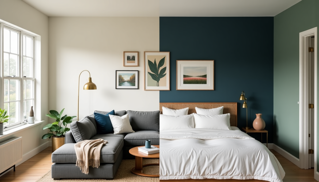
Bedroom Wall Colors That Designers Choose for Rest
The bedroom stands as your most personal sanctuary - a space where wall color does far more than please the eye. Professional designers select bedroom hues with dual purpose: creating a beautiful space that also promotes quality sleep and relaxation.
Sleep-enhancing hues designers use in their bedrooms
Blue tones dominate designers' own bedrooms, and science backs this choice. These colors lower heart rates and reduce stress levels through a fascinating biological process - blue is processed by specialized receptors called ganglion cells in our retinas that signal the hypothalamus to produce more sleep-inducing melatonin and less cortisol. For a different approach, interior designer Liz Carroll chooses moody green (specifically Benjamin Moore's Great Barrington Green) in her bedroom spaces, creating an enchanting, forest-like retreat that pairs beautifully with deep browns and neutral textiles.
Soft, warm colors create cozy, intimate bedroom atmospheres, while cool tones establish calm, refreshing environments. Need a truly tranquil bedroom that helps you drift effortlessly to sleep? Neutral tones like Benjamin Moore's White Dove deliver a clean, crisp vibe without feeling sterile. Muted green-blues like Sherwin-Williams' Rain Cloud bridge classic and contemporary styles with timeless sophistication.
The newest trend among designers' personal bedrooms? Delicate pinks. Benjamin Moore's First Light serves as an excellent alternative to white or beige, creating an airy, fresh atmosphere. Farrow & Ball's Setting Plaster offers rose-tinted warmth with earthy undertones that mimic that magical golden hour light.
Creating contrast with bedding and decor
While coordinating bedding with wall color creates a beautiful, calming effect, most designers prefer getting creative with thoughtful contrasts. California-based interior designer Jen Dallas explains, "A big design mistake is having the same exact color for everything without variation in a room. You need highs and lows to make a room feel more interesting".
The 60-30-10 rule guides many designers' bedroom color decisions - main color on walls (60% of the space), accent features like bedding and curtains (30%), and accessories (10%). For a bedroom that feels cohesive yet interesting, try using shades in the same color family for bedding and walls rather than exact matches.
Designers build cohesive contrast by starting with a color palette they love, then adding interest through layers - from wall paint to duvet covers, pillows, and throws. White sheets remain the go-to choice for designers who prefer a clean, fresh aesthetic, working particularly well with natural wood and earthy textures.
Designer tricks for small bedroom spaces
Small bedrooms benefit from two different designer approaches. First, pale and pastel colors applied above eye level create an airy effect that visually raises walls. Try painting your ceiling a lighter shade or slight variation of the wall color to add depth without disrupting color harmony.
The second approach might surprise you - many designers use dark colors in compact bedrooms. Helen Shaw, Director of Benjamin Moore, explains: "When working with a small area, dark colors cleverly absorb light, making the division between walls appear blurred. This 'blurred edges' effect adds depth and dimension, making it appear larger". Designer Tanner Sammons demonstrates this perfectly by using black walls to create a sophisticated, cocoon-like atmosphere ideal for sleeping.
To maximize small bedroom spaces, paint walls, ceiling, and baseboards in the same color. This prevents your eye from being drawn to room corners, creating the illusion of more space. Not ready to commit to all-over dark colors? Try a feature wall in navy or charcoal balanced by lighter tones elsewhere for a cocoon-like effect without overwhelming the space.
Kitchen and Dining Areas: Bold Choices Designers Make
The kitchen buzzes with energy - food sizzles, conversations flow, and families connect. Professional designers believe kitchen colors should match this vibrant character. While they might play it safe in other rooms, kitchens are where designers make their boldest color statements, even in their own homes.
Cabinet and wall color pairings designers love
Want to know what professional designers actually choose for their own kitchens? Many consistently select deep, slate gray for lower cabinetry paired with white upper cabinets and ceilings. This grounding combination creates a smooth transition between natural wood elements and decorative flooring. Designer Melissa Anderson uses this approach to balance panoramic views through skylights and windows.
Color-rich cabinets against neutral walls remains a designer favorite. Palmer Weiss kept her paneled ceilings white when using emerald green (S6030-G by Fine Paints of Europe) to prevent the space from feeling overwhelmingly dark. Many designers now choose Calke Green by Farrow & Ball paired with warm brown cabinets—a combination that creates a vibrant backdrop for family gatherings while balancing modern design elements with natural hues.
Unexpected color moments in designer kitchens
Think designers play it safe with kitchen colors? Think again. Despite conventional wisdom favoring neutral kitchens, designers increasingly choose unconventional hues for their own spaces. Yellow has become an unexpected favorite, with designer Galeana Younger embracing electric yellow cabinet hues in her mother's house. She advises, "If you're going to go bold in your house, really push the envelope and do whatever sparks joy every time you walk into the room".
Burgundy makes dramatic appearances in designers' personal kitchens too. This deep tone works beautifully on cabinetry when echoed in natural stone elements like Cristallo Blue quartzite, creating harmony through repetition. Designers are also embracing purple, terracotta, and even unexpected pastel blue cabinets in their own homes.
How designers use color to define dining spaces
Color psychology guides how designers approach dining areas. Since red elevates heart rate and metabolism while deep reds increase appetite, designers strategically incorporate these tones through accent pieces rather than full wall treatments.
Creating flow between kitchen and dining areas starts with considering your home's existing style. Together with the dining room's function, this informs your color choices. Laura McCroskey demonstrates this beautifully by selecting creamy white paint and purple-veined marble for kitchen areas that transition into dining spaces, adding depth with charcoal accents on panel refrigerators and freezers.
Unlike vibrant kitchens, designer-approved dining spaces often feature neutral foundations—whites, grays, and soft tones—creating calm atmospheres that enhance meals without distracting from food presentation. This approach allows dining furniture and tableware to take center stage, a priority for design professionals in their own homes.
Bathroom and Powder Room Colors with Designer Approval
Bathrooms offer the perfect playground for color experimentation. These intimate spaces let designers break conventional rules they might strictly follow elsewhere. Professional designers embrace this freedom not just for clients but in their own personal bathrooms too.
Small space color maximalism
Powder rooms have become designers' favorite canvas for dramatic color statements. Patrick Mele's Upper East Side powder room features a "Crayola fever dream" of walls and ceiling that creates instant visual interest. Designer Victoria Sass showcases her pattern passion by combining custom black glazed tiles with Pierre Frey square-motif wallpaper in a Wisconsin lakeside retreat.
The small bathroom color secret designers know? Bold, saturated paint can actually make tiny areas feel larger rather than smaller. This counter-intuitive approach explains why designers often save their most daring color choices for these compact spaces.
Spa-like neutrals designers actually use
While powder rooms get the bold treatment, designers frequently choose soothing neutrals for primary bathrooms. In a classical bathroom within a Federal-style farmhouse, Benjamin Moore's Monroe Bisque—described as "a rich, creamy neutral with a touch of honey"—provides a museum-worthy backdrop for historic elements.
Taupe walls paired with white trim create a peaceful, serene atmosphere that makes even the smallest bathrooms feel luxurious. Need slightly more color without sacrificing tranquility? Many designers select Benjamin Moore's Calluna, a sophisticated variation of lilac that reads slightly darker than a true pastel.
Color coordination with fixtures and finishes
The thoughtful coordination between wall colors and fixtures takes bathroom design to the next level. Designer Linda Hayslett chose Farrow & Ball's Green Smoke for a Texas powder room to continue the green from the home's exterior, creating a seamless transition between outdoor and indoor spaces.
When selecting fixtures, designers prioritize consistency not just in color but also texture and sheen—mismatched elements can disrupt visual flow. Many designers mix metal finishes confidently, with brass and black creating a "no fail classic combination" regardless of vanity color. For a contemporary approach, try pairing quiet grayed-blue walls with deep navy cabinets to give bathrooms sophisticated depth while making spaces feel larger.
Transitional Spaces: How Designers Color Hallways and Entryways
Hallways and entryways might be the most overlooked spaces in your home, yet they're crucial connectors that tie everything together. While many homeowners treat these areas as afterthoughts, professional designers recognize their potential for creating cohesion throughout the home.
Creating flow between rooms
The secret to successful transitional spaces? Professional designers view hallways and entryways as opportunities rather than problems. They suggest treating these areas as part of the "entire vista" rather than separate entities. Most designers limit their palette to just two or three colors used in different amounts throughout the house, with each appearing in varying intensities. This clever technique produces a wide range of effects while maintaining harmony.
Got an open floor plan? Designers recommend choosing colors that relate to each other to naturally draw the eye from one room to the next. Even spaces with strongly contrasting room colors can connect beautifully through flooring or area rugs that incorporate both hues. For hallways with little natural light, designer Marshall Watson prefers yellow because it "emanates warmth and light" without developing the "gray pallor" that white and beige often acquire in windowless spaces.
First impression colors that welcome guests
Your entryway sets the tone for your entire home. For a dramatic welcome that makes an immediate statement, designers often select atmospheric deep blue hues or earthy reds like Burnt Crimson, which creates "a warm and inviting atmosphere". For something more subtle yet sophisticated, designer Kim Alexandruik suggests "putty-colored gray with a hint of pink and lavender".
Many professional designers follow Birch Coffey's philosophy that "a hallway should be the reverse of what's happening around it". This approach creates visual interest while maintaining flow between spaces. In homes with minimal natural light, Susan Zises Green recommends deep blue with green undertones in a glossy finish, creating a "mysterious" cocoon-like effect.
Unexpected ceiling and trim treatments
Want to make a narrow hallway feel more spacious? Designers often extend wall color to the ceiling, drawing the eye upward and making the space feel more expansive. For a cohesive look throughout your home, many designers paint all trim the same color or shade of white. This creates "subliminal cues that make people feel anchored" as they move through different spaces.
In smaller hallways or entryways, try this designer trick: paint walls, ceiling, and baseboards in the same color. This prevents your eye from being drawn to room corners, creating the illusion of more space.
Final Thoughts on Designer Wall Colors
The wall colors professional designers select for their own homes teach us valuable lessons about creating spaces that balance beauty and function. Their personal choices reveal a sophisticated blend of timeless neutrals and strategic bold statements, each carefully matched to the room's purpose.
What matters most in successful color selection? Understanding how natural light transforms color throughout the day. Designers prove this through their careful attention to exposure direction and lighting conditions when choosing wall colors for their personal spaces.
Living rooms typically showcase versatile neutrals that allow for endless decor changes, while bedrooms embrace calming blues and greens that promote restful sleep. Kitchens and powder rooms become the perfect playground for bold color experiments, showing that small spaces actually handle dramatic color choices beautifully.
The biggest lesson from designer homes? Color flow matters more than individual room decisions. Their approach creates smooth transitions between spaces while preserving each room's unique character. This delicate balance between continuity and contrast builds homes that feel both unified and dynamic.
The colors designers choose for their own walls offer practical insights for anyone planning a home refresh. These professional choices show how thoughtful color selection enhances both the visual appeal and functionality of any space, creating rooms that not only look beautiful but feel perfectly suited to their purpose.